There were some grim reports recently – not the least of which was Vancouver Coastal Health’s “Protecting Population Health in a Climate Emergency” assessment of climate change’s effects on human health in our region. The effects of drought, risk of arsenic in the water and effects of wildfire smoke on the Coast came up in the 58-page document.
Now in a world with some depressing forecasts for the future, you know what helps? Vibrant colour – and this Coast needs some.
Now, I spent my early 20s in Newfoundland. The story goes that NL’s famous jellybean houses – which don reds, purples, blues, bright yellows – were painted so that homesick sailors could see them from far off as they returned to port (who knows how true that is).
You know what doesn’t beckon sailors (or weary commuters) home? Developments of off-cement or dirt-adjacent (I think the planning documents call them “Earth tones” as they discourage primary colours).
“Developments should establish an overall colour scheme using typical coastal colours (such as blue, brown, and green) in deeper shades. Bright, intense primary colours and white are only suitable for trim and accent colours,” says the Sechelt OCP in describing downtown guidelines. Boring!
The need for colour came up a couple of times recently in Gibsons meetings – notably at the budget dialogue session Feb. 6. Someone from Nova Scotia’s Lunenburg noted their gorgeous, multi-coloured hometown and suggested Gibsons take a page (or colour) from their book. “It doesn’t need to be garish or wild,” said the speaker. (Though, I, for one, would rather garish and wild to tepid and unremarkable – life’s too short to stick to grey.)
Gibsons councillor David Croal noted that in the early 1990s there was a downtown revitalization project that saw buildings painted colourfully. “There was a colour palette that building owners were given, easy colours you can select to paint your building, and it certainly was much more vibrant than it is today,” he said. “Everyone’s sort of reverted to white and blah!”
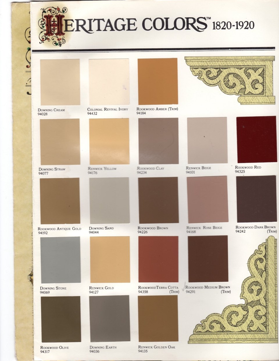
The story goes that Croal was managing the building that now houses the Buono Osteria and used an old heritage colour palette (for buildings 1820 to 1920) to repaint the building. The town planner of the time loved it so much, they used it as inspiration for the revitalization palette.
We’ve done it before, we can do it again. As we undergo OCP reviews, let’s add more colour and vibrancy to our beloved facades.
Leave the grey to the skies.


